Design to improve user engagement in mobile E-learning

Overview

Knowunity is an EdTech app focused on school content. We were tasked with enhancing engagement among a specific group of users. I led the research phase, guiding my team to uncover user motivations and recommend design changes to the product team. Building on these findings, we independently redesigned key features focused on user engagement and growth.

Impact

Launched 6+ feature optimizations in 2024 Q1; Due to a research-informed UX strategy shift, we scaled target users by 700%; Created a design system from 0-1

Role

Product designer

Team

Product designers

Product manager

Scope

User research, ideation, visual revamp

Background

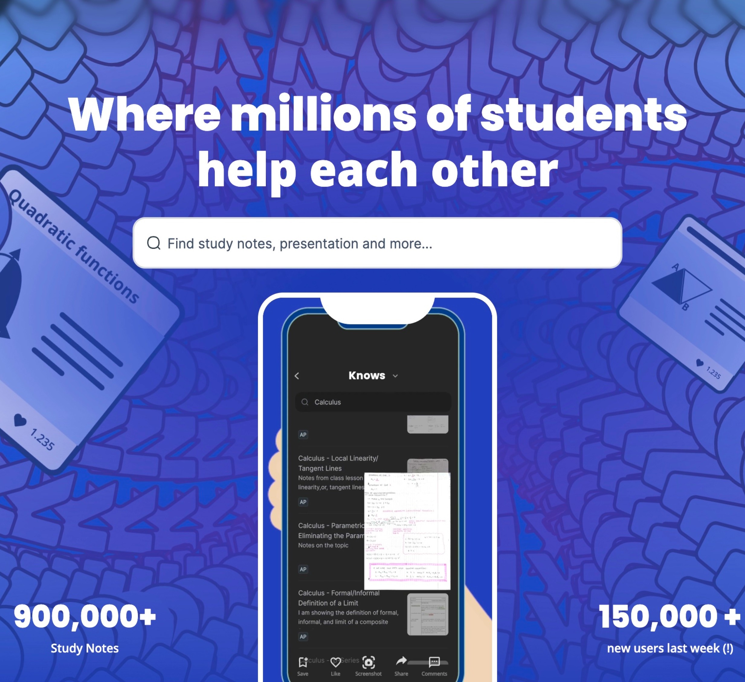
Knowunity is Europe’s fastest-growing edu-tech app with 13 millions users

Knowunity is transforming peer-learning for K-12 students through its mobile app, which allows students to share study notes and answer questions in a social, community-driven platform.

Background

On this platform, "knowers" are students who actively create and share academic content (study notes) to help others "learners".

Our platform thrives on the energy of knowers (those who share academic content) and learners (those who consume it). By contributing to peer-to-peer learning online community, students earn volunteering points, a valuable asset for US college applications,

Problem

…However, the company's vision of growing US users is difficult. This is because of two things…

#1 Unknown motivation

"Knowers" share and post a LOT more than regular users. But what motivated them?

-> How might we understand and boost their motivations through design?

#2 Low discovery

Content created by Knowers wasn't easily discoverable

-> How might we help great content reach more people?

Final solution #1

Complete tasks to earn points

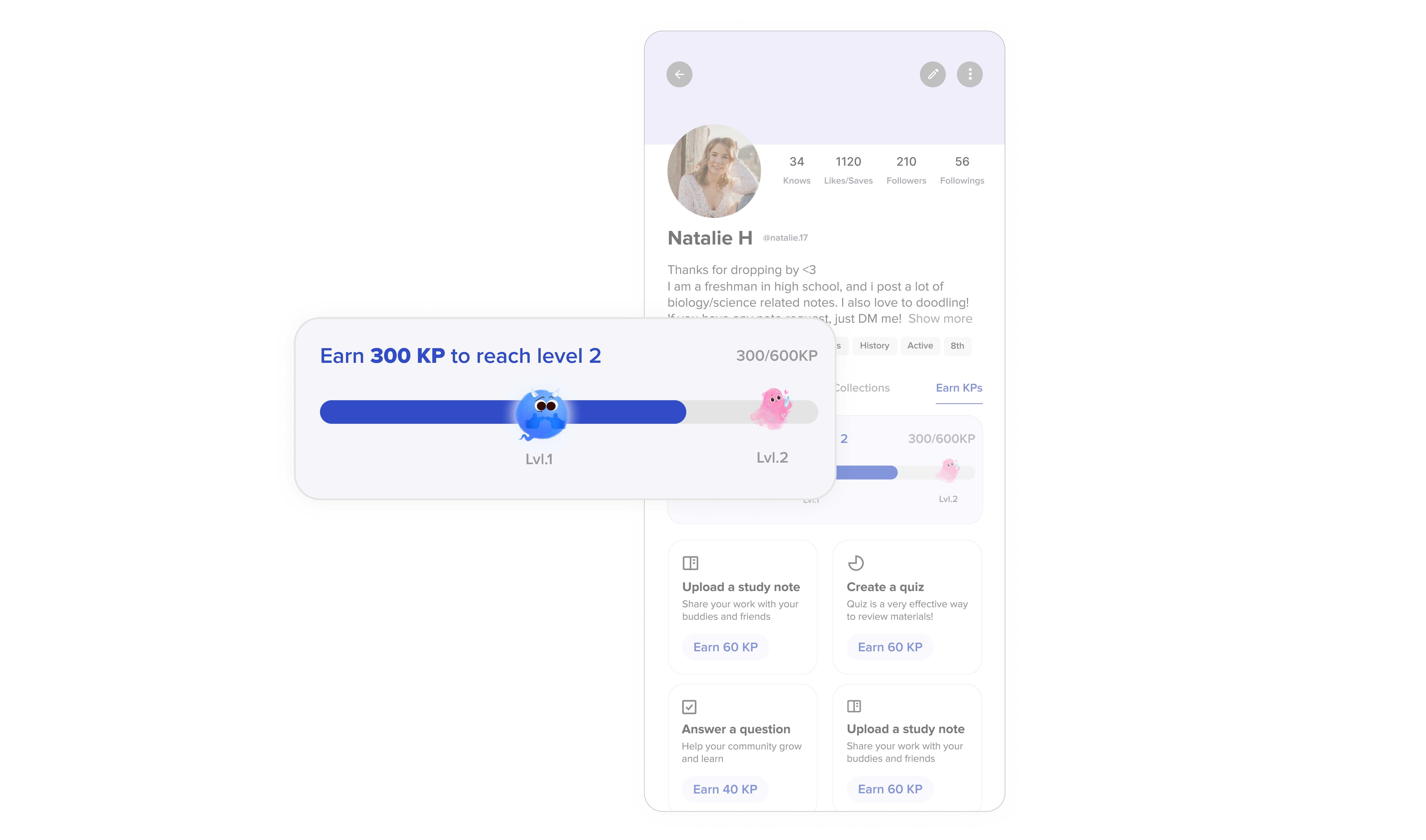
Knowers who post content are rewarded with KP points. These points can be exchanged for volunteer hours, which are an essential incentive for Knowers.

Final solution #2

Always work toward the next milestones

Knowers are motivated by knowing what their next milestone is and tracking their progress towards it. This clarity helps them stay focused and motivated.

Final solution #3

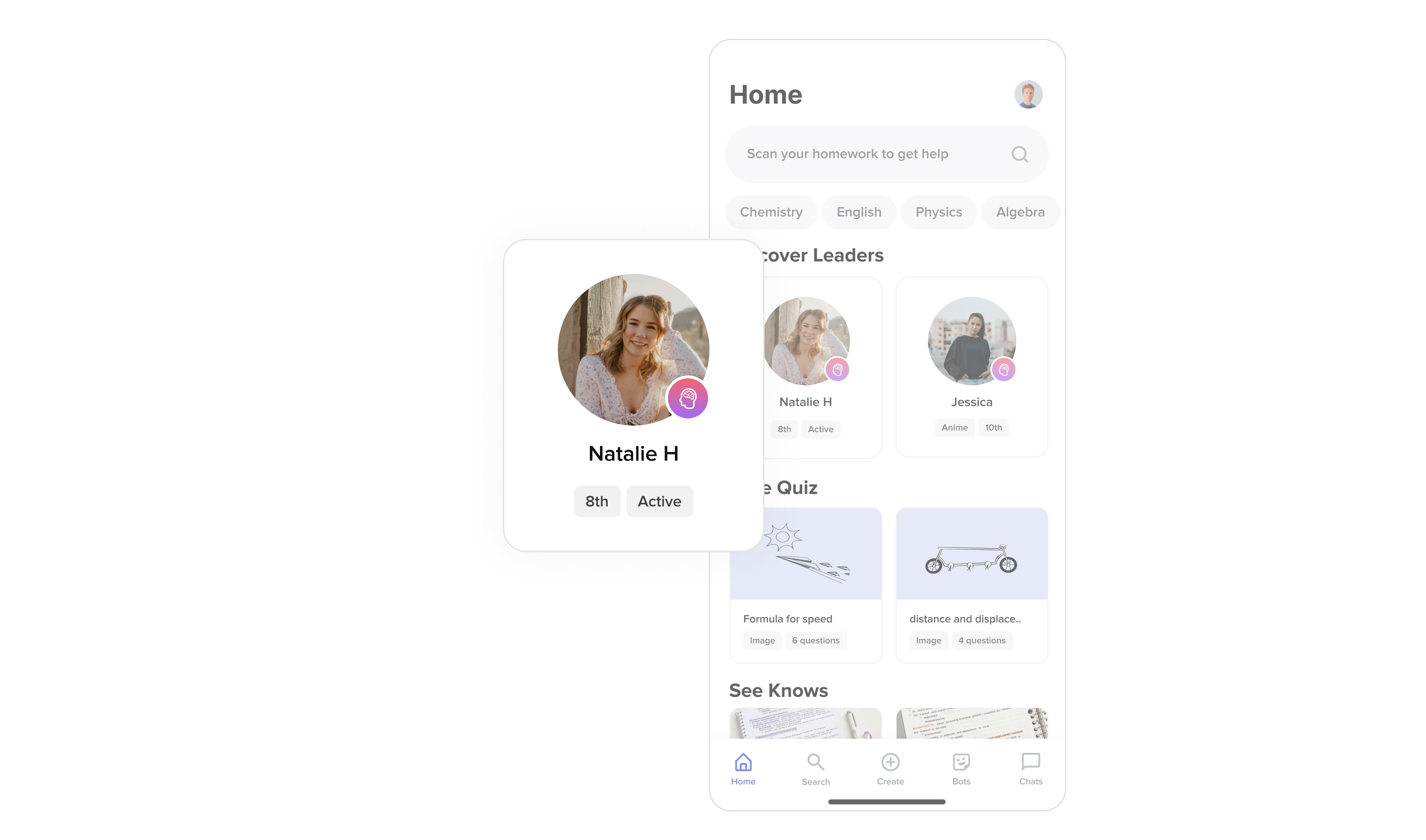
Get featured on the home screen

Learners can now access study materials and connect with knowers from the home page. Great way to learn!

Starting point

We hypothesised a ripple effect: if we engage the knowers and motivate them to create high-quality content, it will attract more learners to the platform, driving overall user growth in the US.

Research summary

Research into knower motivation and content utilization

#1 Knowers are

Internally motivated by a helping spirit and externally motivated by earning volunteer hours from sharing.

Knowers are the busy bees, helpful and nerdy kids in school. Having an online community allows them to share more notes with peers in need. They drew a great deal of fulfillment from the content creation experience.

"It allowed me to help more people. If someone asks for my class notes, I just send over my entire folder from knowunity."

#2 About knowers' content, they said

"Not sure how other students found my notes. It feels random…?"

Learners reported finding good content rather random; and knowers weren't sure how people are discovering their content.

Design goal

Design goal

To boost engagement among the knowers, we should make content sharing motivating, and help quality content get discovered by more learners.

Challenge #1

Design to boost user motivation and improve engagement

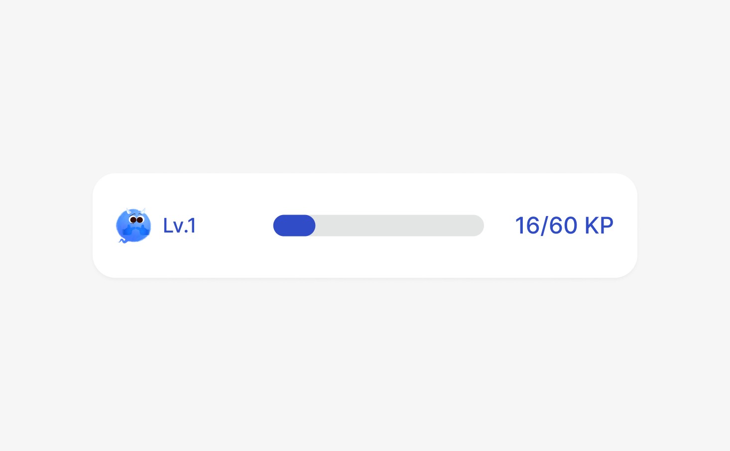
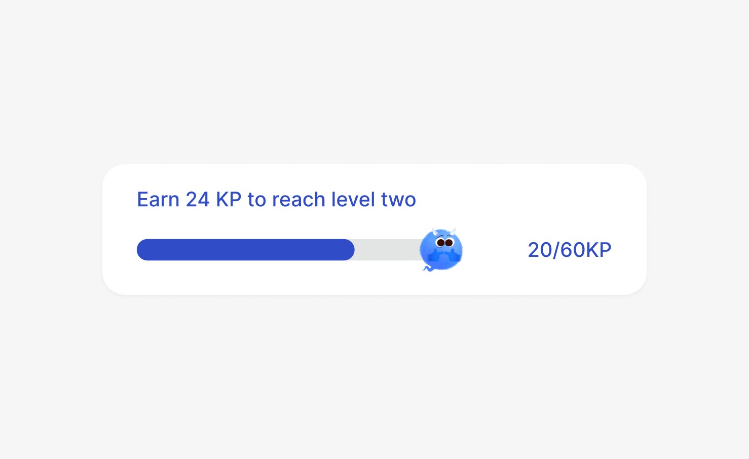
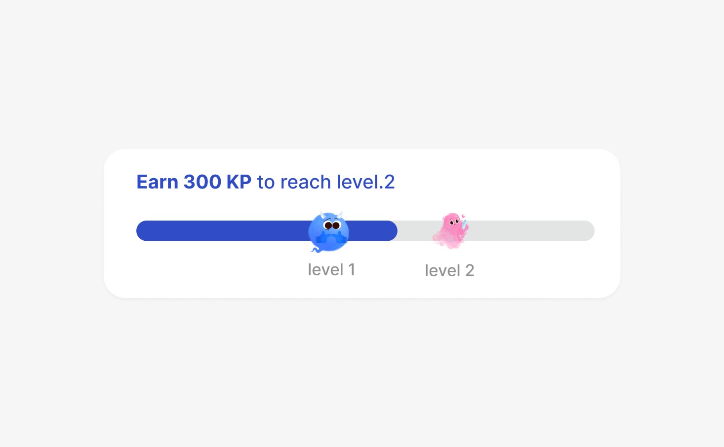
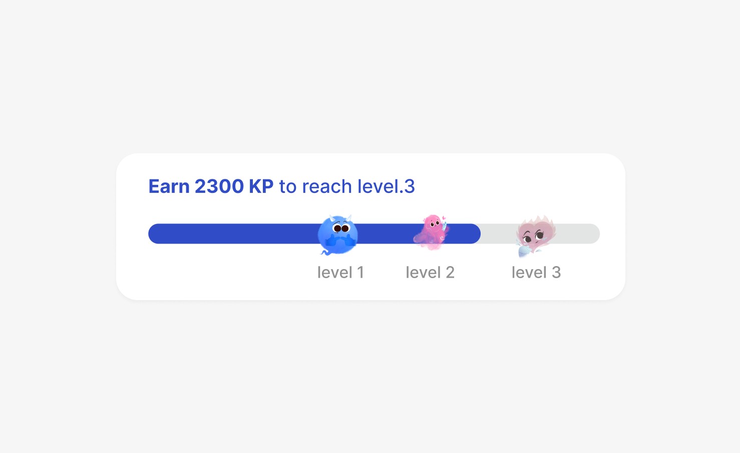
Progress bar Iterations

Feels motivating but not overwhelming

I ideated and explored the design of progress bar. The final design incorporats elements like current level, next level, and progress, keeping creators motivated and excited.

option a. show the current level

cons: creators is not clear what the next level is

option b. current level and supporting text on actions needed for next level

cons: no visual indicator of what the next level is

final option. the current level and the next level

pros: clarity on currentlevel, action needed, upcoming level; enough info to feel motivated; card is visually balanced

cons: characters overshadowed by the text of " levels"; placement and size of the characters

option d. the current level and the upcoming two levels

cons: the 3rd level is too distinct; feel overwhelmed by the amount of points needed to get there

Challenge #2

Make it easy to discover high quality contents from knowers

Currently,

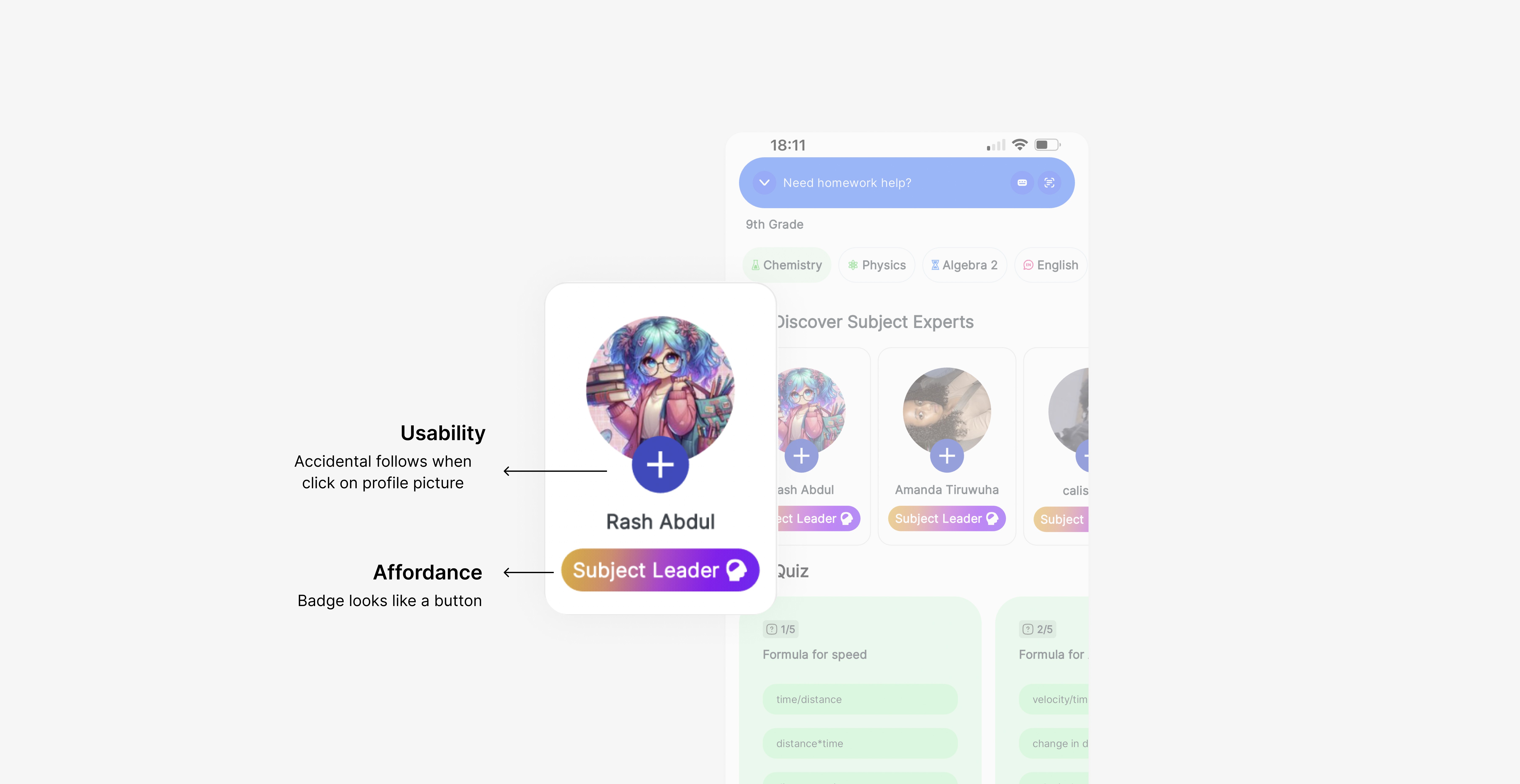
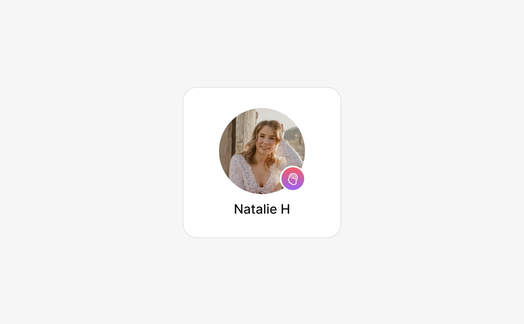
Knower card lacks in usability, and doesn't help users to easily identify which knower to follow

On the APP home page, the card design didn't help users to distinguish knower, making it difficult to decide whether or not to follow a person, or who exactly to follow.

Card redesign

Prioritize distinguishable information & visual hierarchy

In my exploration, I try to achieve two outcomes for users: 1) it is easy to click into a profile to see more 2) there is information to help users choose which knower to see more

option a. remove follow icon (unlikely to follow a creator without seeing their profile)

cons: the subject leader badge still looks like a button

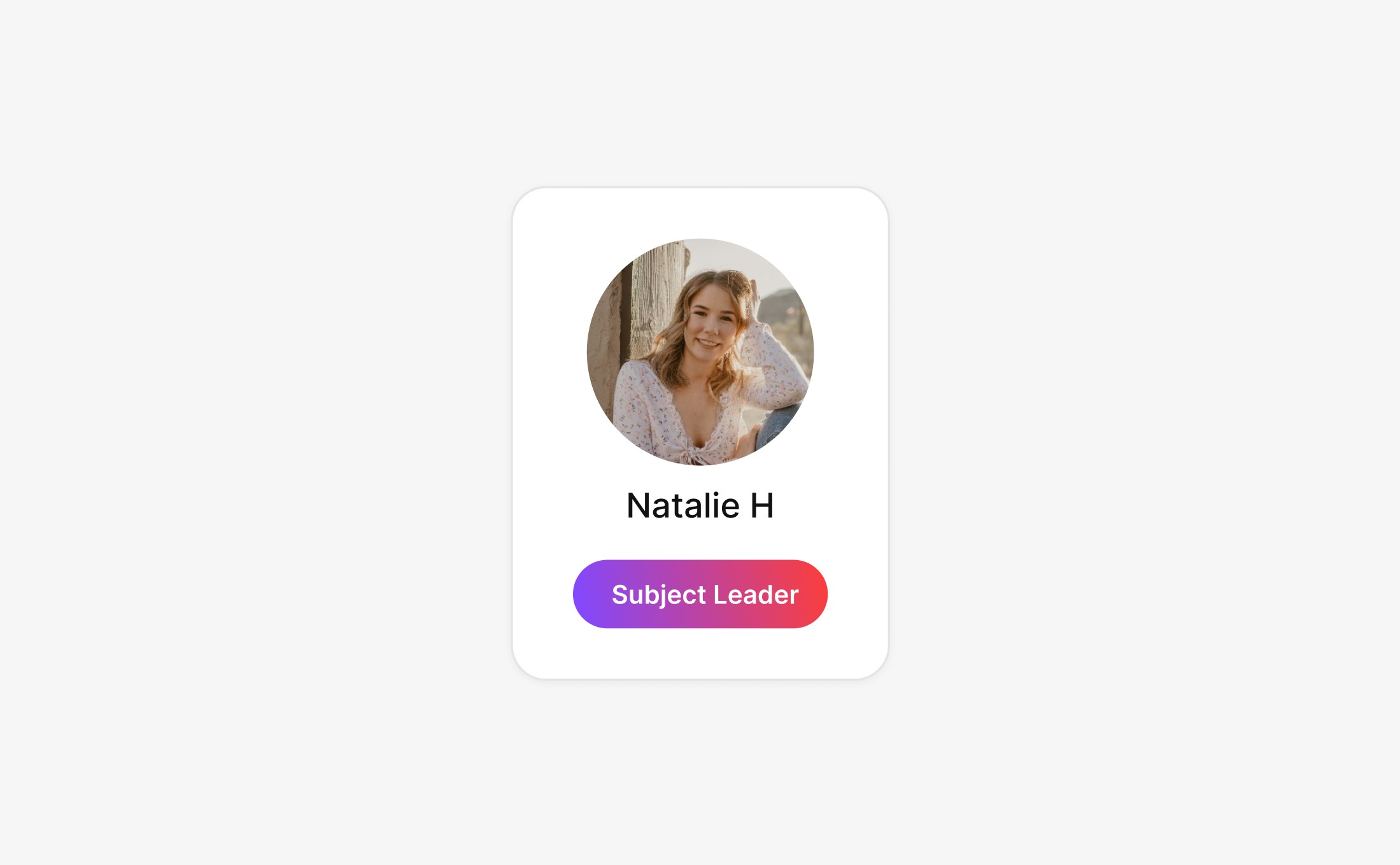
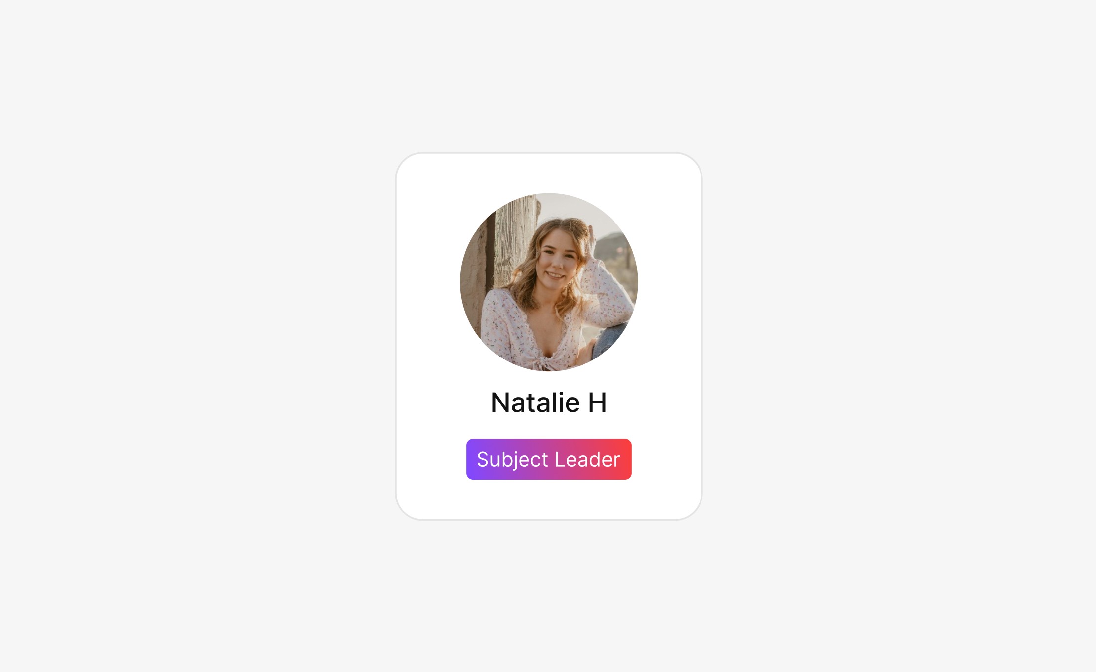
option b. less radius for the badge, distinguish it from a button

cons: visual prominence of the badge distracts users

option c. a special icon to represent knower

cons: decision-making is still tough, users can't tell the difference between each creator

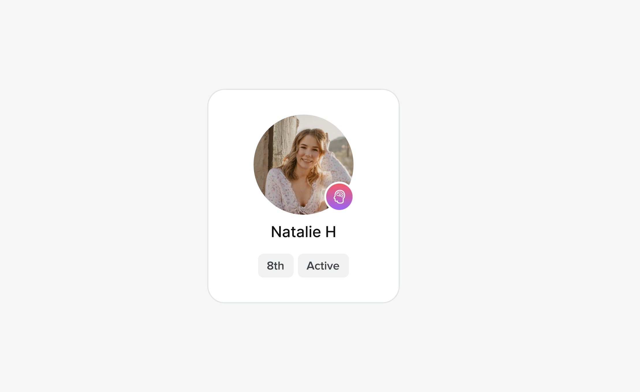
final option. add tags to show relevant info, helping learners to make decision faster

pros: specificity of the tag helps learners identify the relevance of the creator with themselves, eg. similar grade, class, and hobbies

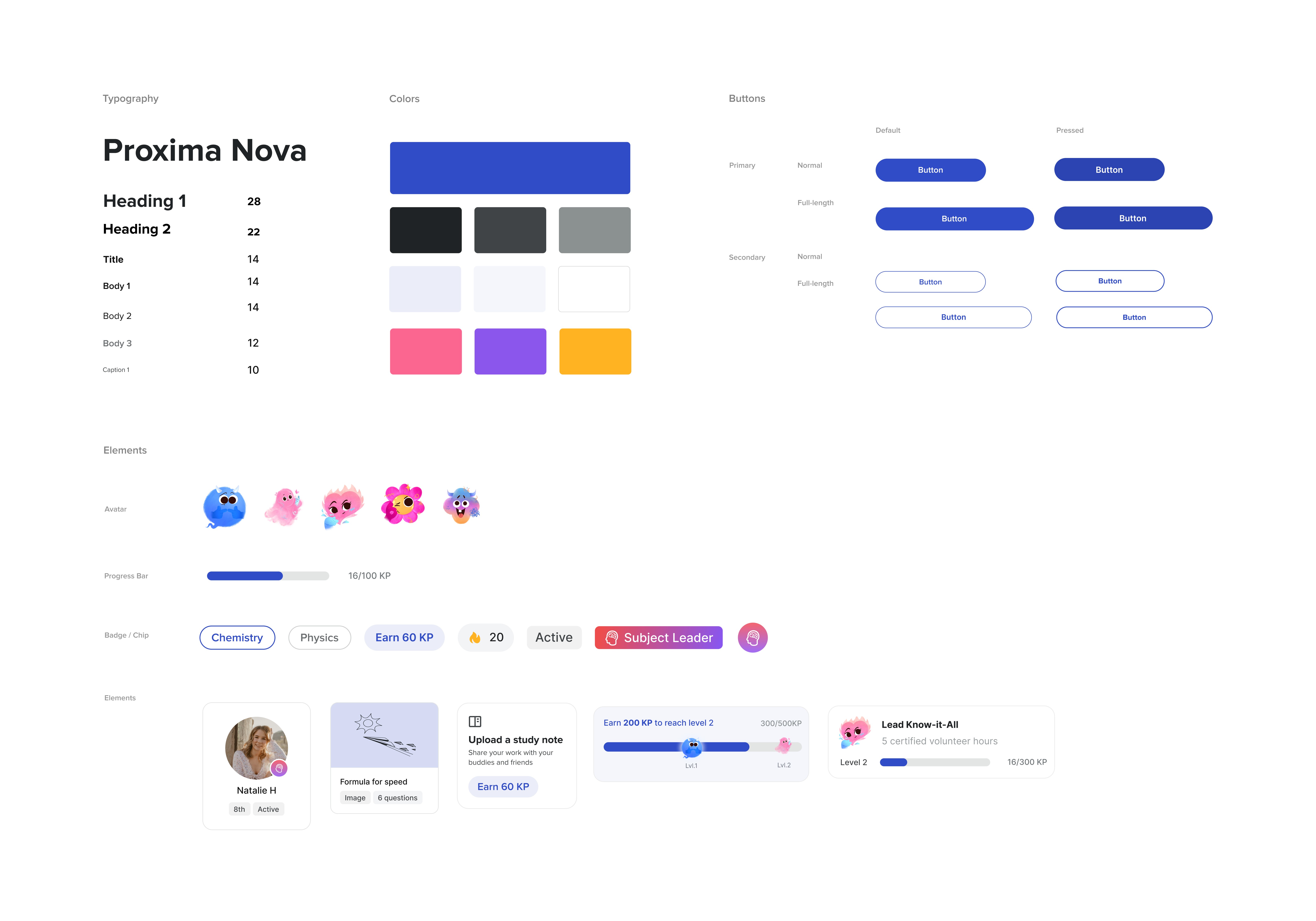
Visual guide

Design for consistency and scalability

User testing

Improved content engagement & motivation

"It's motivating that every time i share my notes, I know how many KP points I earned!"

Users said that the new immediate reward helps them to stay engaged.

"The new profile makes it easy to track my progress!"

Users believed the new information architecture of the profile page helps them reach their goals easier and more consistently.

Key learnings

Deep understanding of product metrics 

It doesn't hurt to ask stakeholders about the rationales of existing product metrics. It helps designers evaluate strategies and critique features more objectively, often leading to insightful research questions and unexpected discoveries.

Hypotheses can be productive

Productive assumptions are key, provided we know when to adapt based on findings. When ideas and assumptions fail, I made a promise to myself to do two things. First, understand why we formed the initial assumption initially. Second, what did we learn from the new information, and how it inspired future steps? 
See more of my work

AI-Powered recruitment for sales hiring

AI-Powered essay writing tool for college applications

Design by Andrea with love & lattes

Design by Andrea with love & lattes

Design by Andrea with love & lattes