How did I design to drive 614% user growth and engagement in an E-learning?
Growth Design
Mobile UI/UX
Gamification

Problem
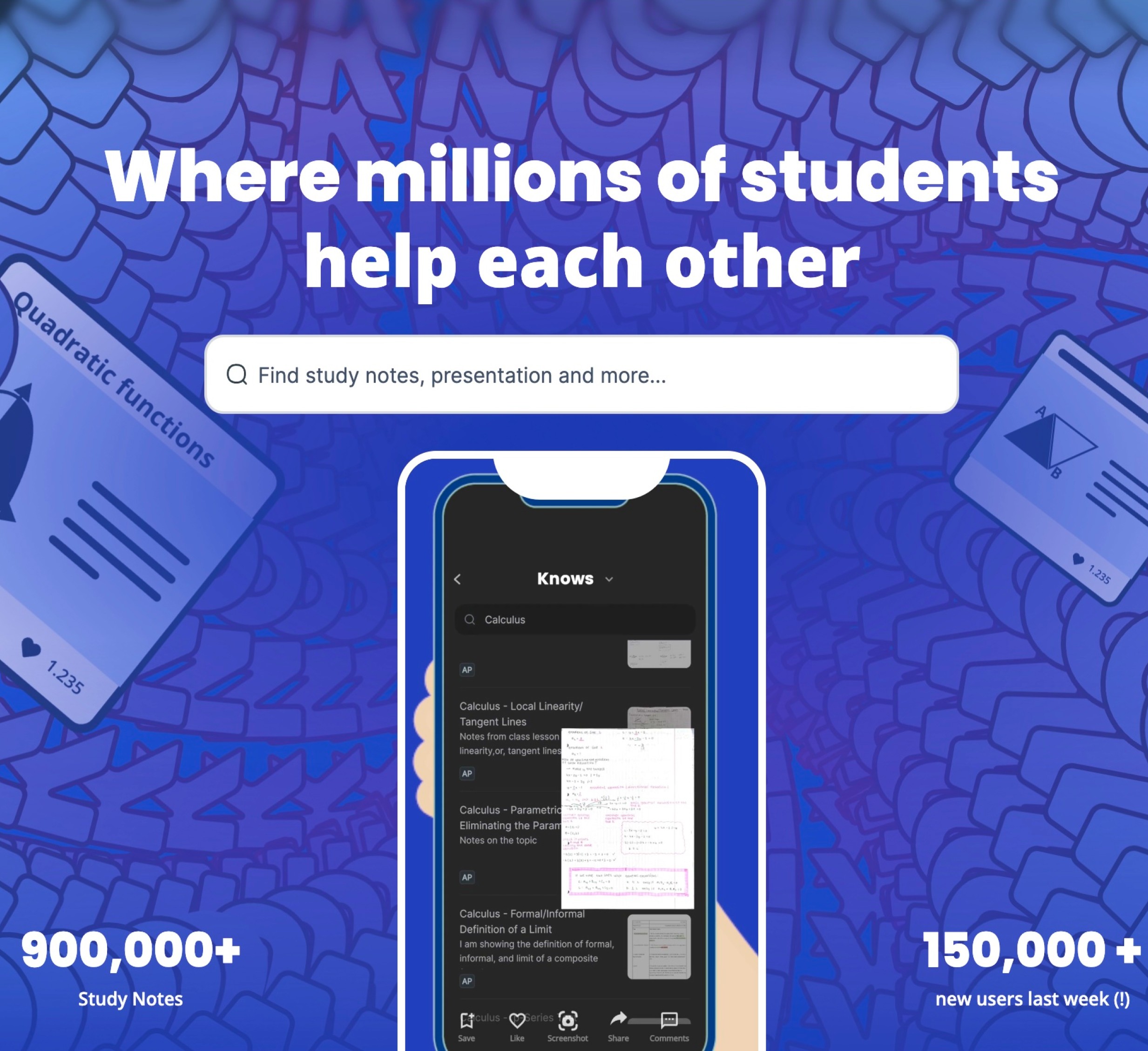
Originally founded in Germany, Knowunity is a leading peer-learning app serving 13 million K–12 students globally. As it expanded into the US, the key challenge was to grow the user base and increase engagement among top academic content creators.
Impact
I interviewed 6 active creators to understand their motivations, then redesigned key pages using gamified UX to drive content creation and retention. The improved experience led to a 614% growth in target creators and a 30.9% increase in core engagement metrics in 2024.
Role
Product designer
Team
1 product manager
1 community manager
3 designers including me
Timeline
15 weeks
Skills
User Research
User Interface
Design System
Visual Design
Context
Understand the challenge of growth and globalisation
Background
Knowunity is Europe’s fastest-growing edu-tech app with 13 millions users
Knowunity transforming peer-learning for K-12 students through its mobile app, which allows students to share study notes and answer questions in a social, community-driven platform.
Background
On this platform, academic creators (knowers) actively share content to help other users (learners)
The platform thrives on the energy of students. By sharing contents like notes and study tips to an online community, students earn volunteering points, a valuable asset for US college applications,
Problem
Currently, the company's vision of growing US users is difficult. This is because of two things…
#1 Unknown Motivation
Leading creators share and post a LOT more than regular users. But what motivated them?
How might we understand and boost their motivations through design?
#2 Low Discovery
High-quality content wasn't easily discoverable
How might we help great content reach more people?
Final Solution
Final outcome sneak peak
# Gamification
Complete tasks to earn points
We've found that volunteer hours (redeemed from KnowPoints) are the biggest motivator for Knowers. Our gamified experience makes it easy and fun to earn points while making a positive impact.
# Milestone
Always work toward the next milestones
Academic creators are motivated by knowing what their next milestone is and tracking their progress towards it. This clarity helps them stay focused and motivated.
# Discoverability
Get featured on the home screen
Users can now connect with academic creators from the home page.his helps them to access study materials they need.
Here are the impact we made!
+614%
Target user growth
+30.9%
High-quality content upload
Increased
Community connection
Start with team alignment
Align on business goals and assumptions
To kick off the project, my team held multiple meetings with various stakeholders to deeply understand and clarify business goals, context, and current hypothesis.
Business goal
Expanding into the US, business wants to grow the user base.
Growth hypothesis
If we engage the creators better to produce more high-quality content, it will attract more learners to the platform, driving overall user growth in the US.
Target users
Our project focused on understanding leading content creators on knowunity, which are users who actively post on the platform, and who has more than 15 posts, 100 members in their group chats, and 100 followers.
User research
Research into motivations & creator experiences
I led my team to send our surveys via email, and interviewed with 6 of our top 11 U.S.-based creators. From there, we identified key motivation behind and frictions, which help set the foundation of
Finding#1: Motivations
Who are these motivated student creators? They are…
Academic-focused busy bees
They care deeply about their academic performance. They often focused on sharing their strongest work online.
Motivated by earning KP points
KP points earned from posting content can earns volunteering hours, which are a big part of college applications.
Genuinely enjoy helping others
They drew a great deal of fulfillment from the helping others. Having an community allows them to help more peers.
Finding #2: Opportunities
What concerns & frictions do creators face?
Has good material, but forget to post
When school gets busy, they can forget to share on the platform, resulting from a lack of goal & accountablity.
Want connection, not followers
They wish to be " super helper" and making connections with like-minded peers, instead of growing their followers
Uncertain about their reach
They weren't sure how people are discovering their content, and what can they do to improve the reach.
Design goal
Design Details
Key design decisions for growth & engagement
Challenge #1: How do I engage creators to share content and earn points more easily?
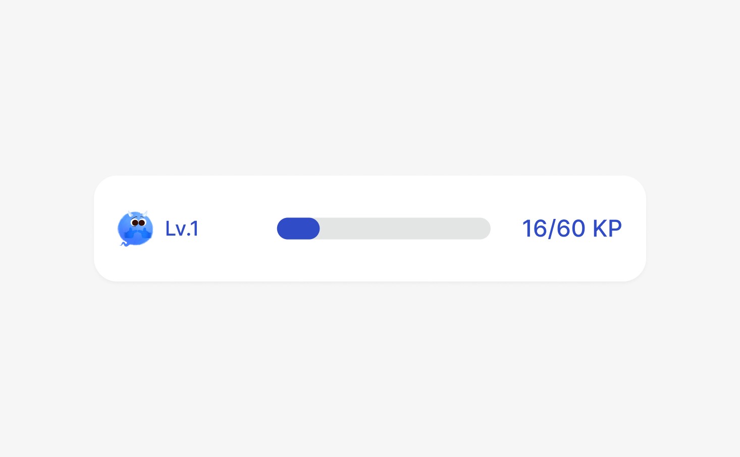
Old progress bar
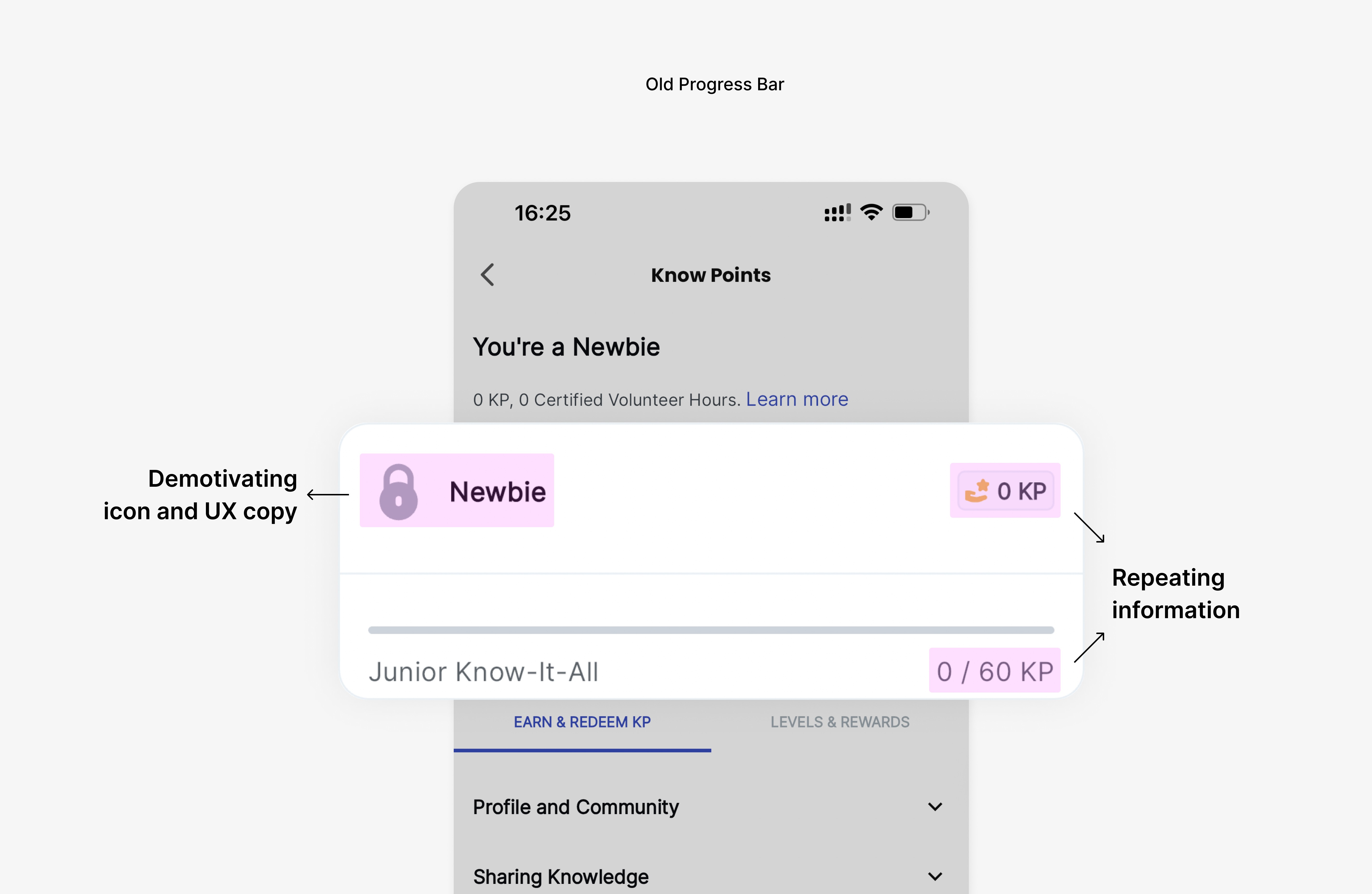
Existing progress card feels demotivating and plain
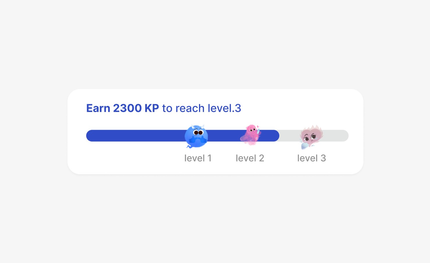
The mobile app already uses gamification elements like progress and milestone to keep experience engaging. However, experience was not ideal; for examples, the current progress card repeated the same KP number multiple times and didn’t clearly show progress.
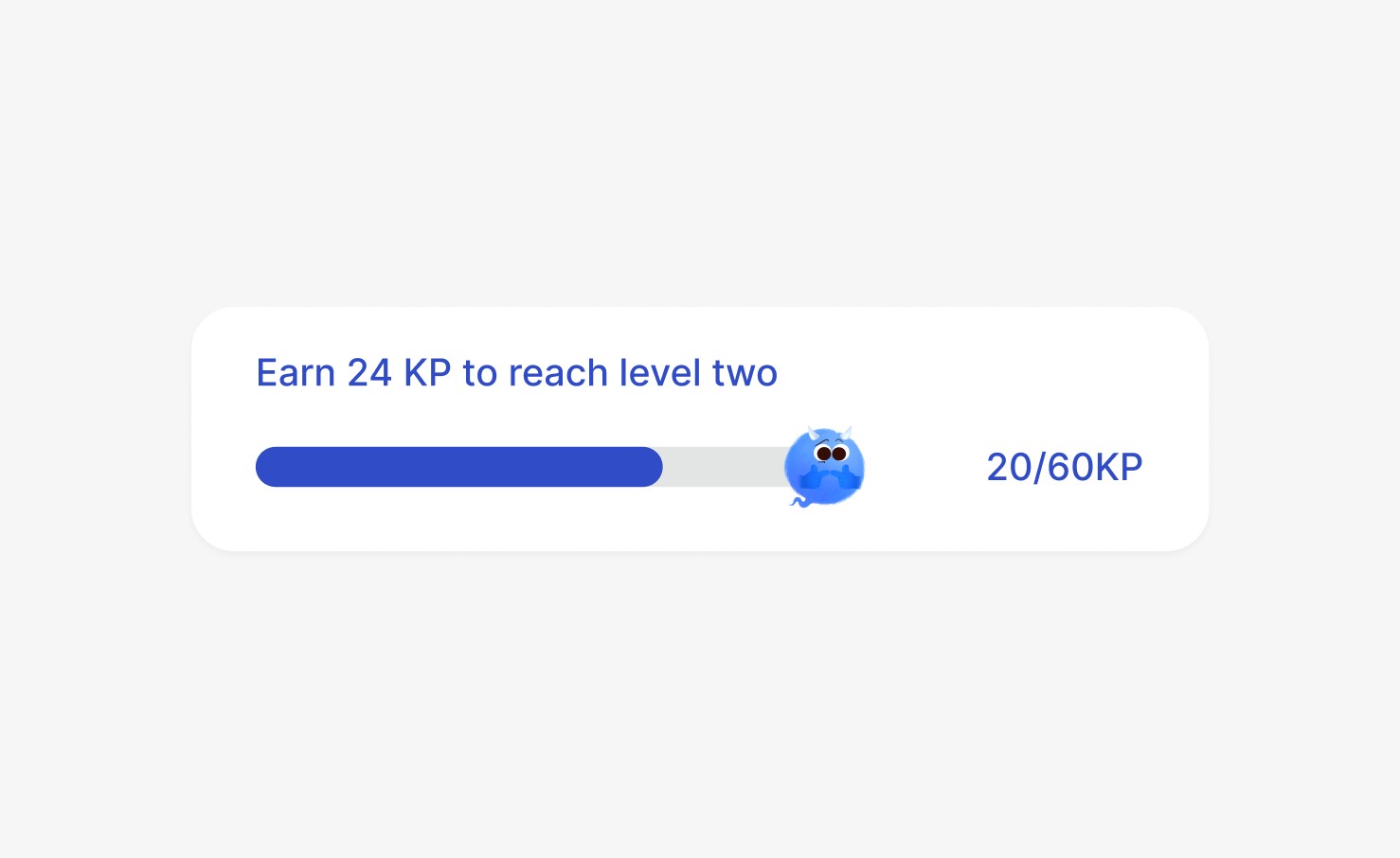
Progress bar redesign
Make progress feels more motivating, less not overwhelming
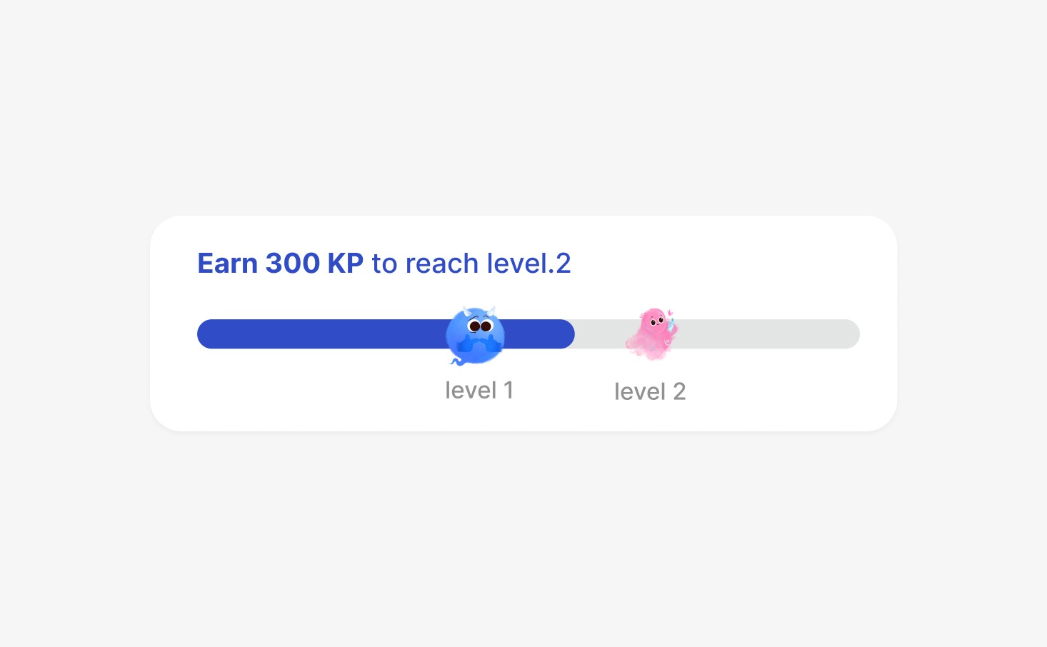
I ideated and explored the design of progress bar. The final design incorporate elements like current level, next level, and progress, keeping creators motivated and excited.
option a.
cons: creators is not clear what the next level is
option b.
cons: no visual indicator of what the next level is
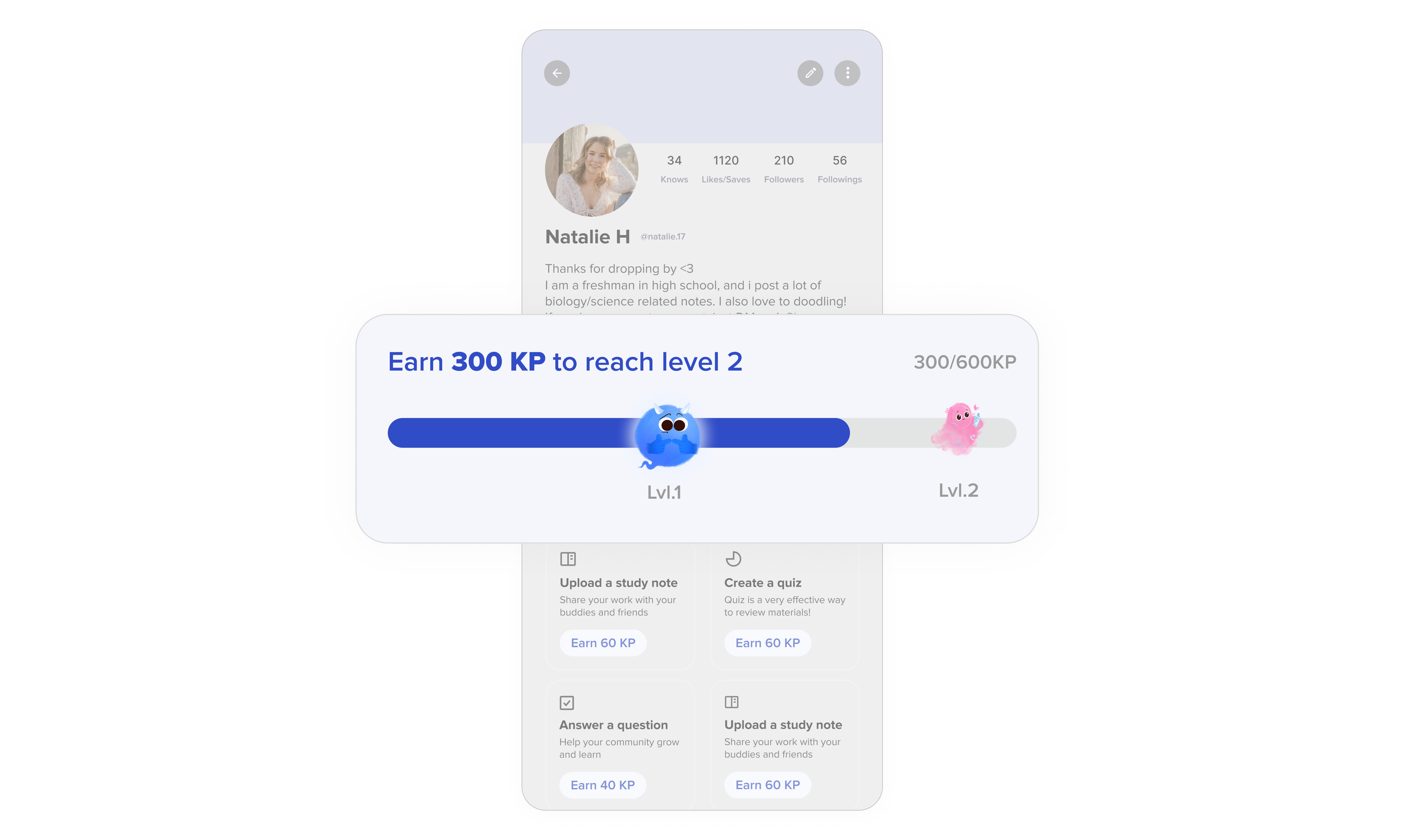
Final design
Challenge #2: How do I make good content more discoverable?
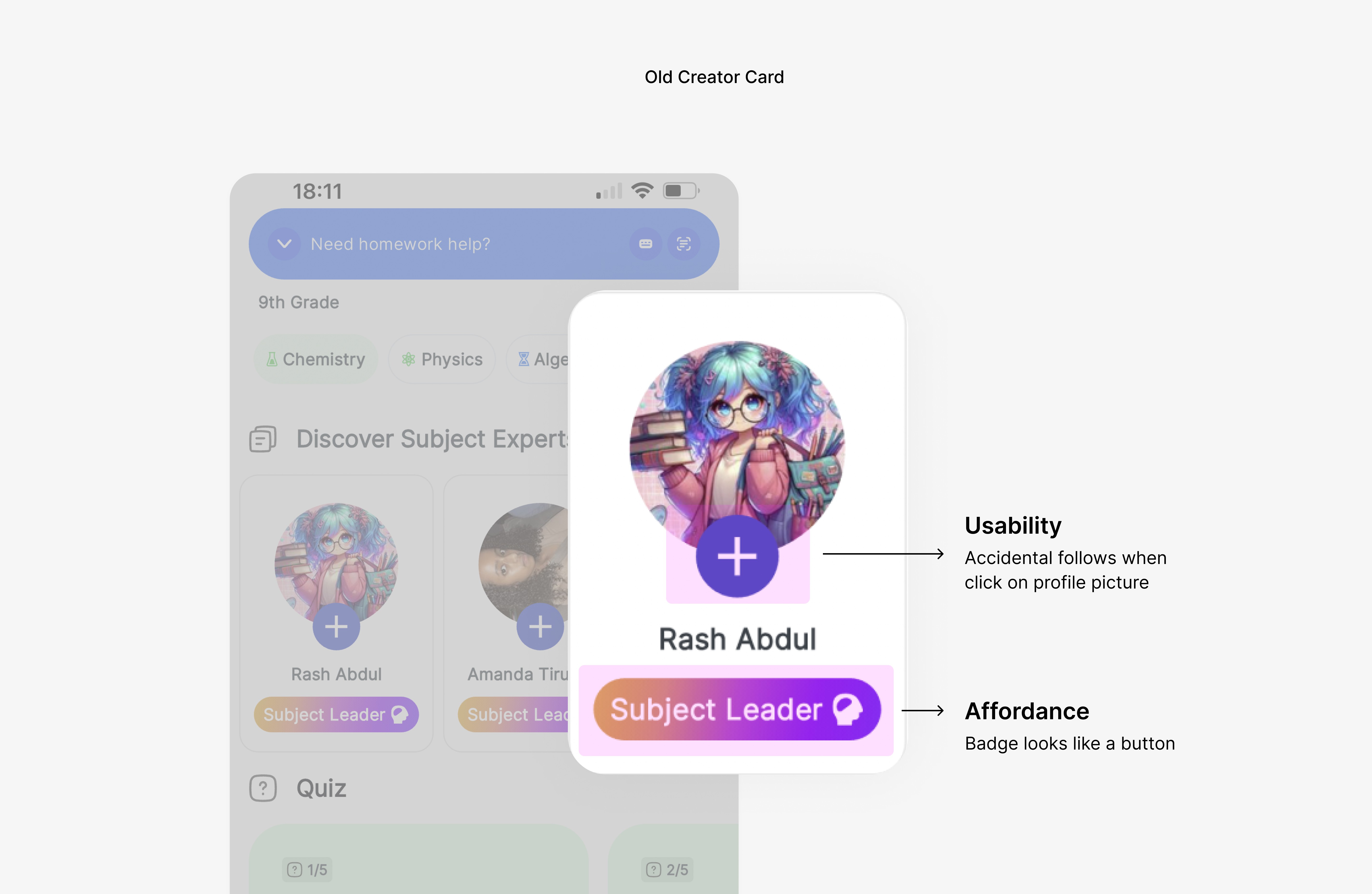
Old creator card
Current creator card lacks in usability and personalization elements
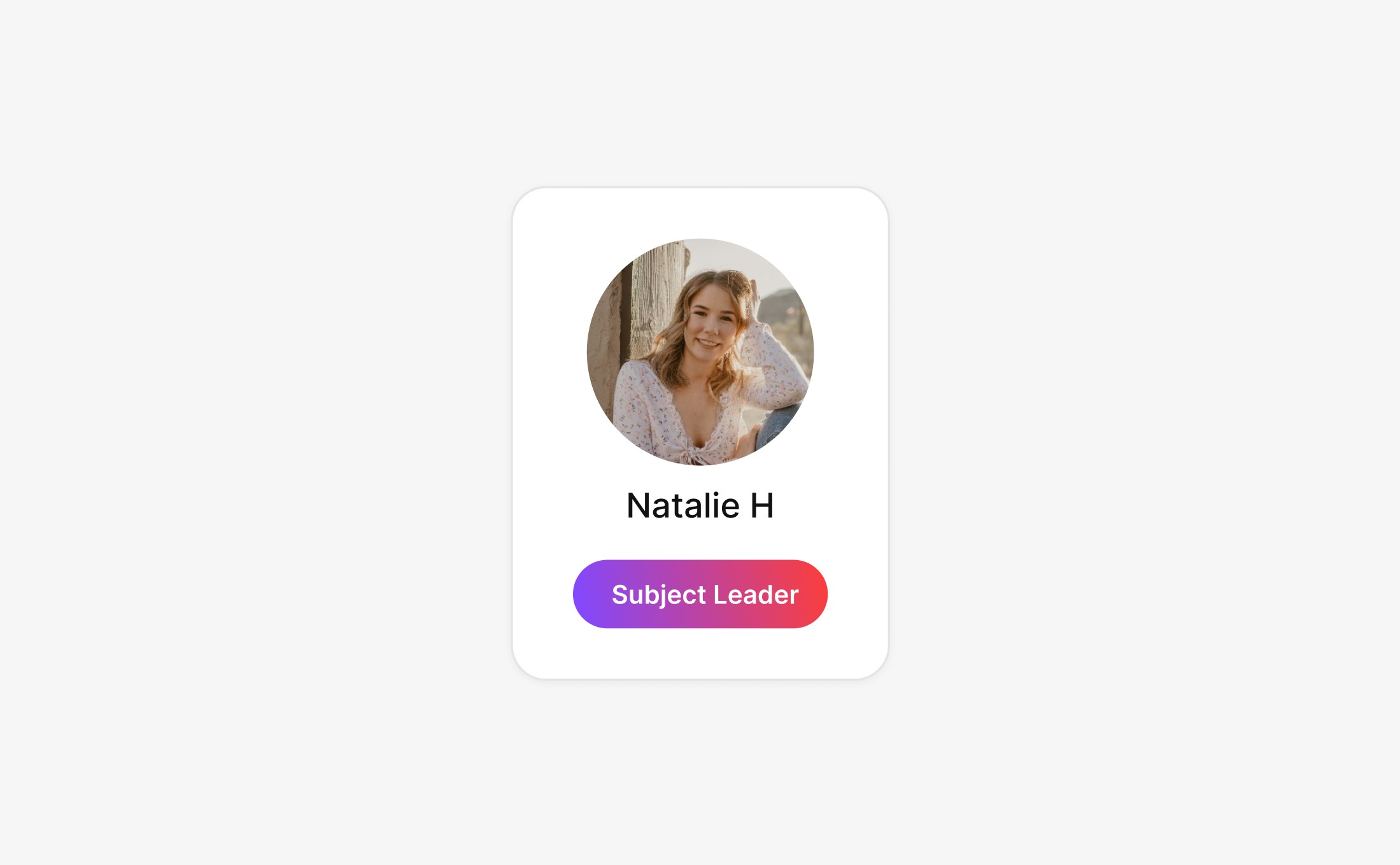
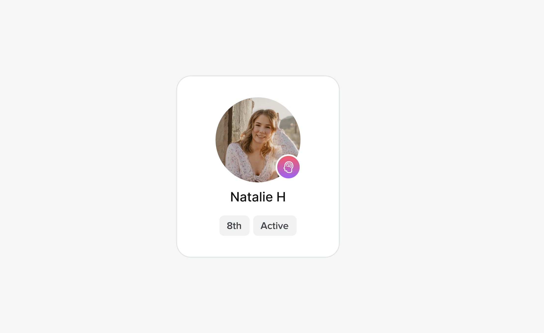
On the APP home page, the card design didn't help users to distinguish knower, making it difficult to decide whether or not to follow a person, and who exactly to follow.
Card redesign
Prioritize distinguishable information & visual hierarchy
In my exploration, I try to achieve two outcomes for users: 1) it is easy to click into a profile to see more 2) there is information to help users choose which knower to see more
option a. remove follow icon (unlikely to follow a creator without seeing their profile)
cons: the subject leader badge still looks like a button
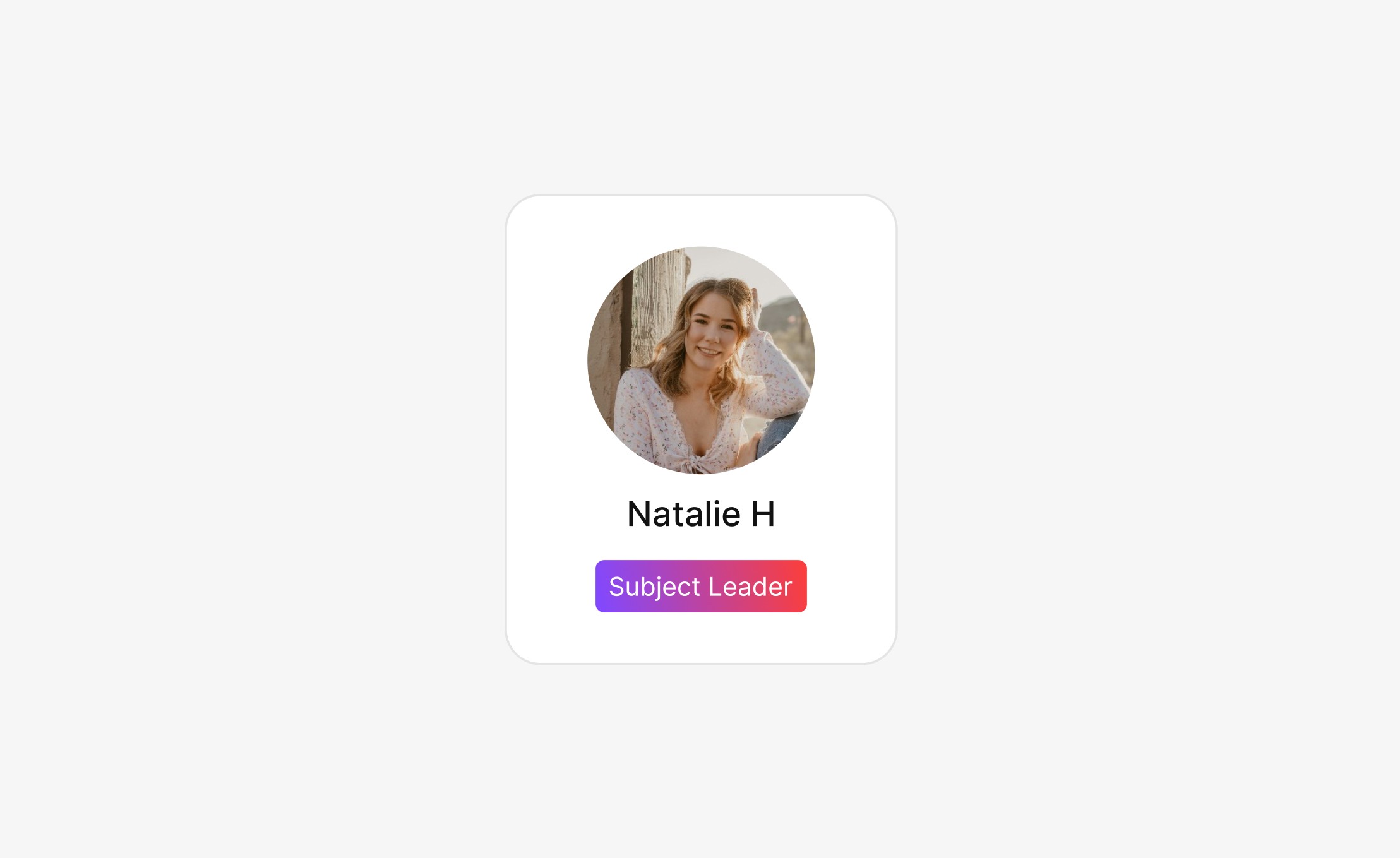
option b. less radius for the badge, distinguish it from a button
cons: visual prominence of the badge distracts users
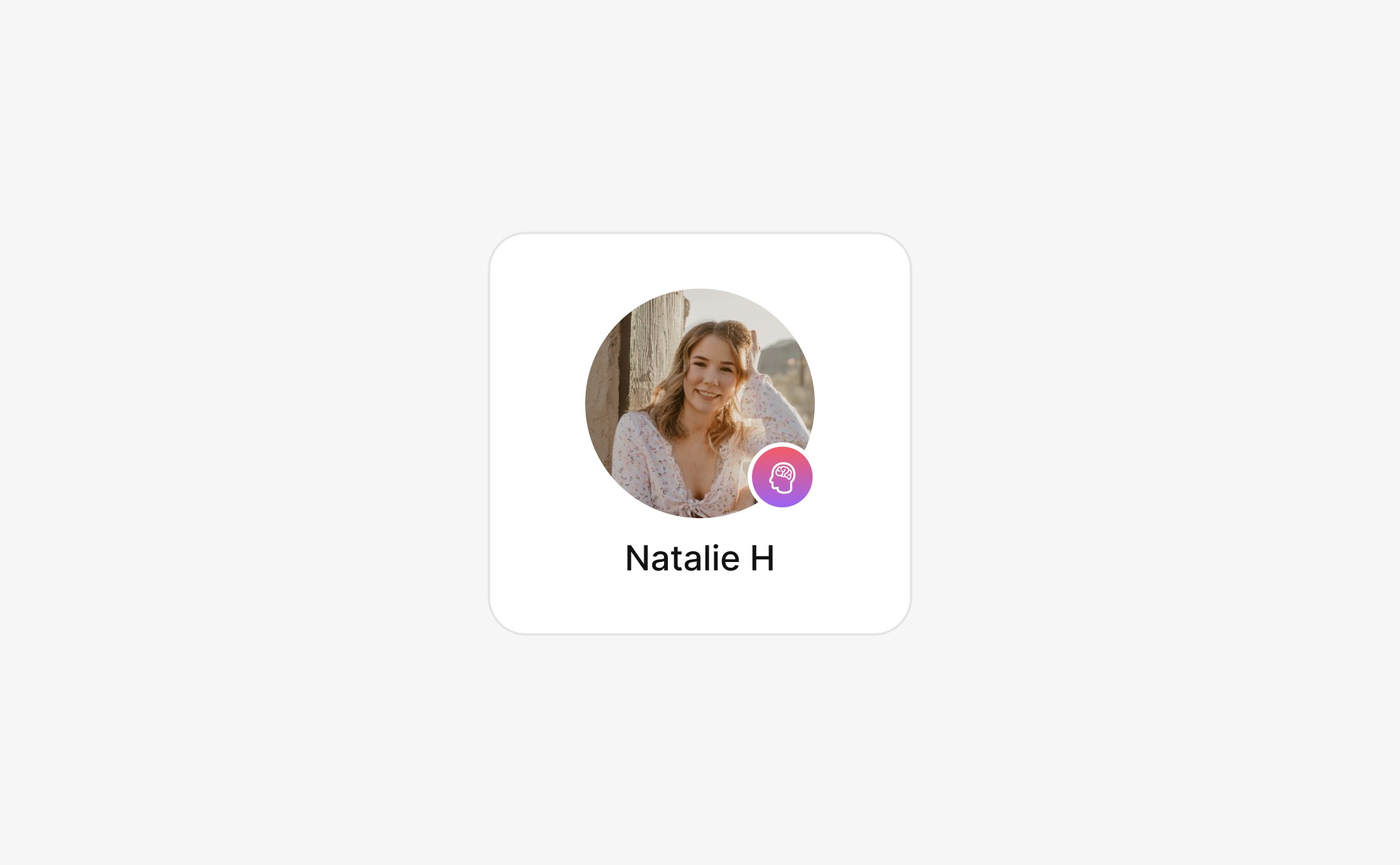
option c. a special icon to represent knower
cons: decision-making is still tough, users can't tell the difference between each creator
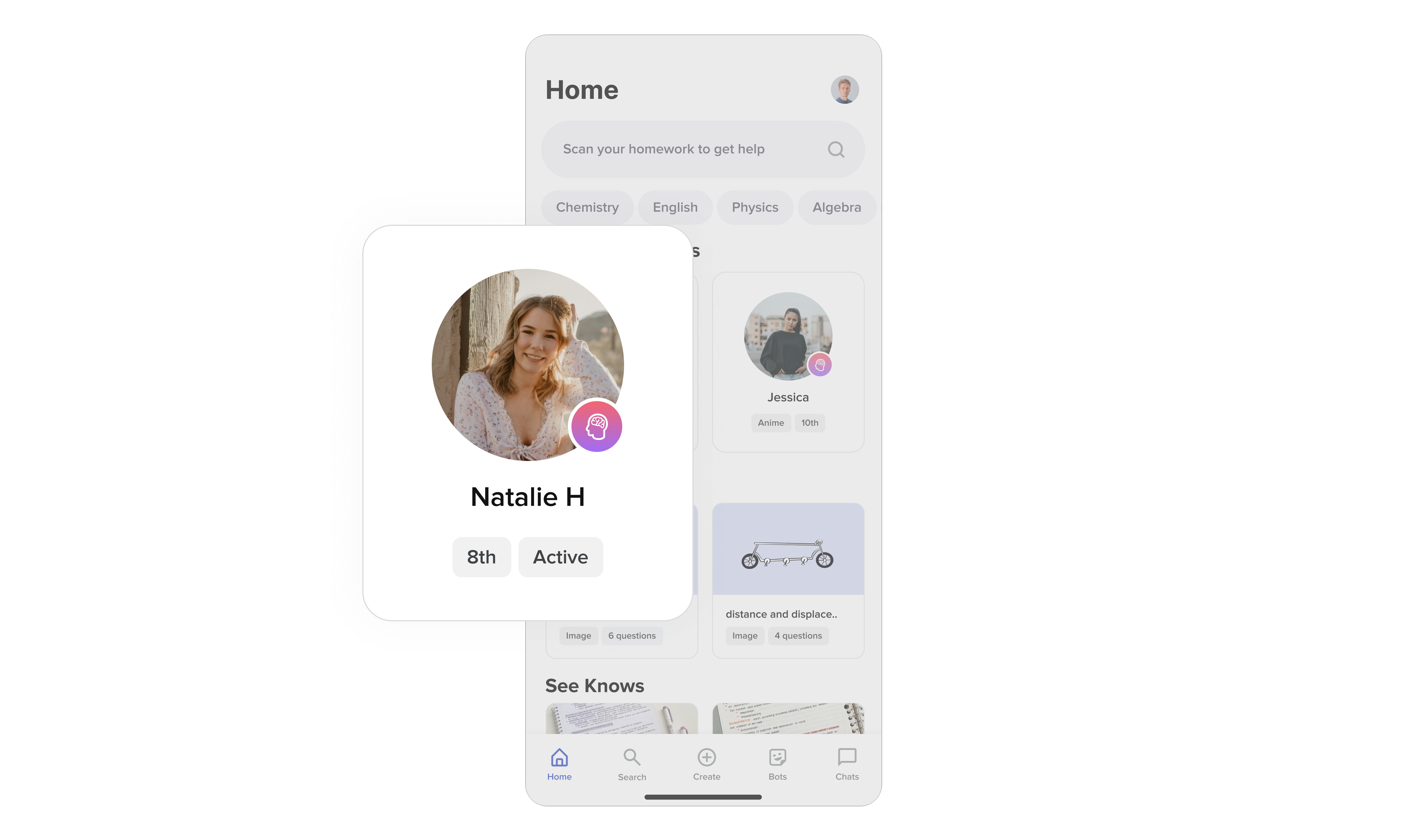
Final design
Visual Guide
Improve consistency and ease of use with design system
While doing design audit and interviews with content creators, I realized that inconsistent visual styles and scattered components also became a barrier to keep users engaged and focused on current tasks. Therefore, my team purposed a revamp of visual guide and design systems, ensuring consistent style and more seamless user experience.
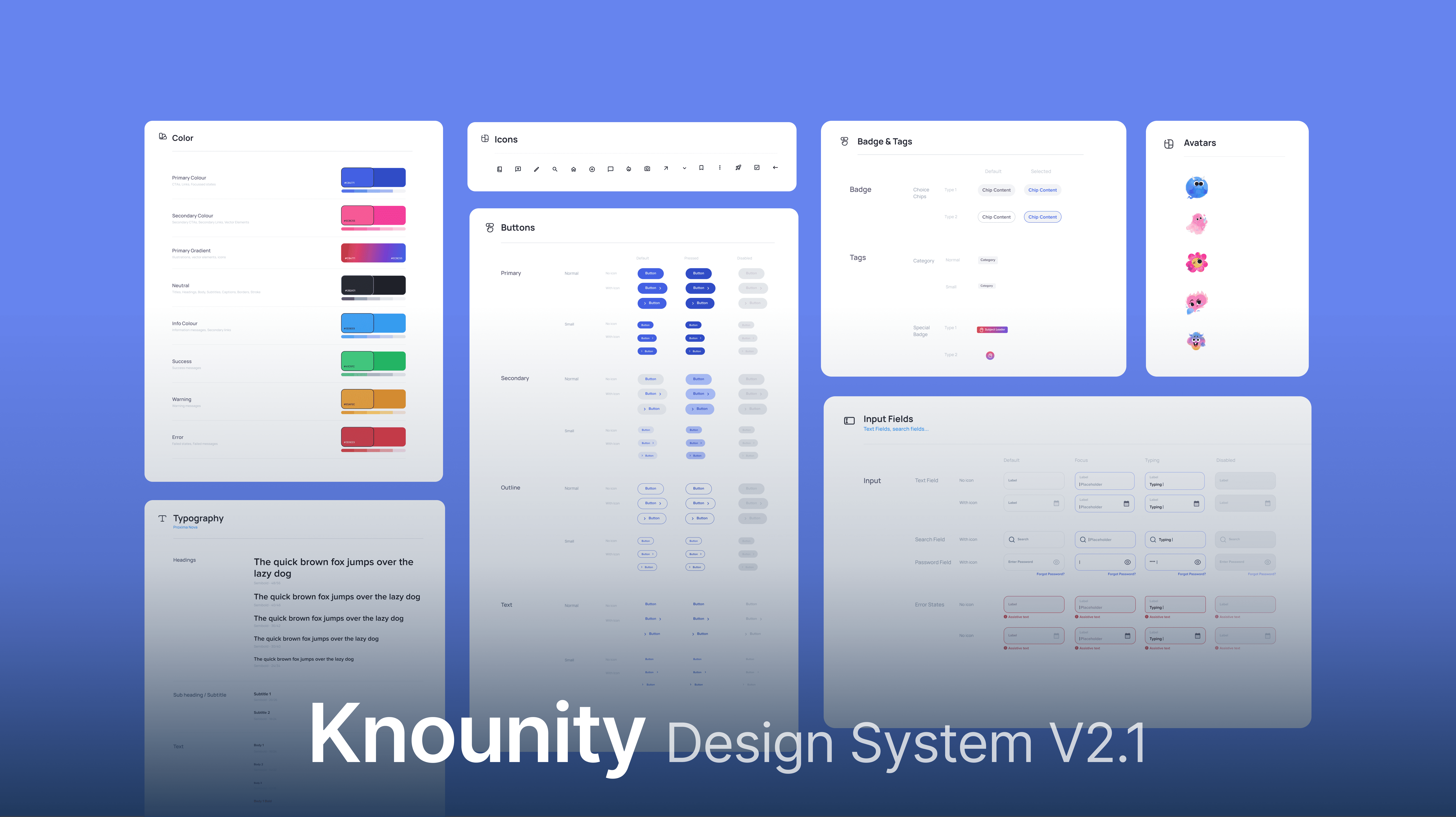
Interested in my design system case study? Click here!
Impact & success
After we delivered UX research and design recommendation, I stay connected my stakeholders ( product manager, community manager) and followed up in 3 months to track the impact of our projects. Learning about the positive impact our project made made us very happy :)
✅ 614% increase
in target user growth in 2024 Q1
🚀30.9% increase
in high-quality content upload
😎 Improved connection
between creators & learners
