How did I create a design system to drive growth and design-dev collaboration?
Problem
Knowunity is Europe’s fastest-growing edtech platform, helping students learn through peer-generated study content. As it expanded into the US market, inconsistent and non-reusable components became a barrier to user engagement and product scalability.
Impact
I led the revamp of a simple, scalable design system using atomic design principles—improving consistency and streamlining collaboration, with a projected 25% reduction in design–engineering time.
Role
Product designer
Team
2 developers
1 product manager
3 designers including me
Timeline
12 weeks
Skills
Design System
Visual Design
Documentation
Context
Design system couldn’t support growth goals
As Knowunity expanded into the US market, its existing design system lacked the scalability and structure to meet growing product demands. Initial research revealed two areas of weakness.

Visual Inconsistency
Fragmented UI patterns weakened brand perception and made it difficult for students to learn and use new features.
Design–Engineering Misalignment
The absence of a full functional system led to duplicated effort, slower delivery, and frequent meetings between teams.
Challenge
Inconsistency hurt engagement and trust
Users described the experience as confusing and disjointed. Without consistent visuals or patterns, navigation felt unpredictable—making it harder for students to stay oriented or return to the app.

Process & Methods
How do I develop a design system that is simple and scalable?
Design audit: uncover key inconsistencies
I audited the mobile experience across core user flows and reviewed the existing component library. The audit uncovered repeated UI patterns, inconsistent spacing, and visual mismatches that weakened the overall experience.


Apply atomic design principles
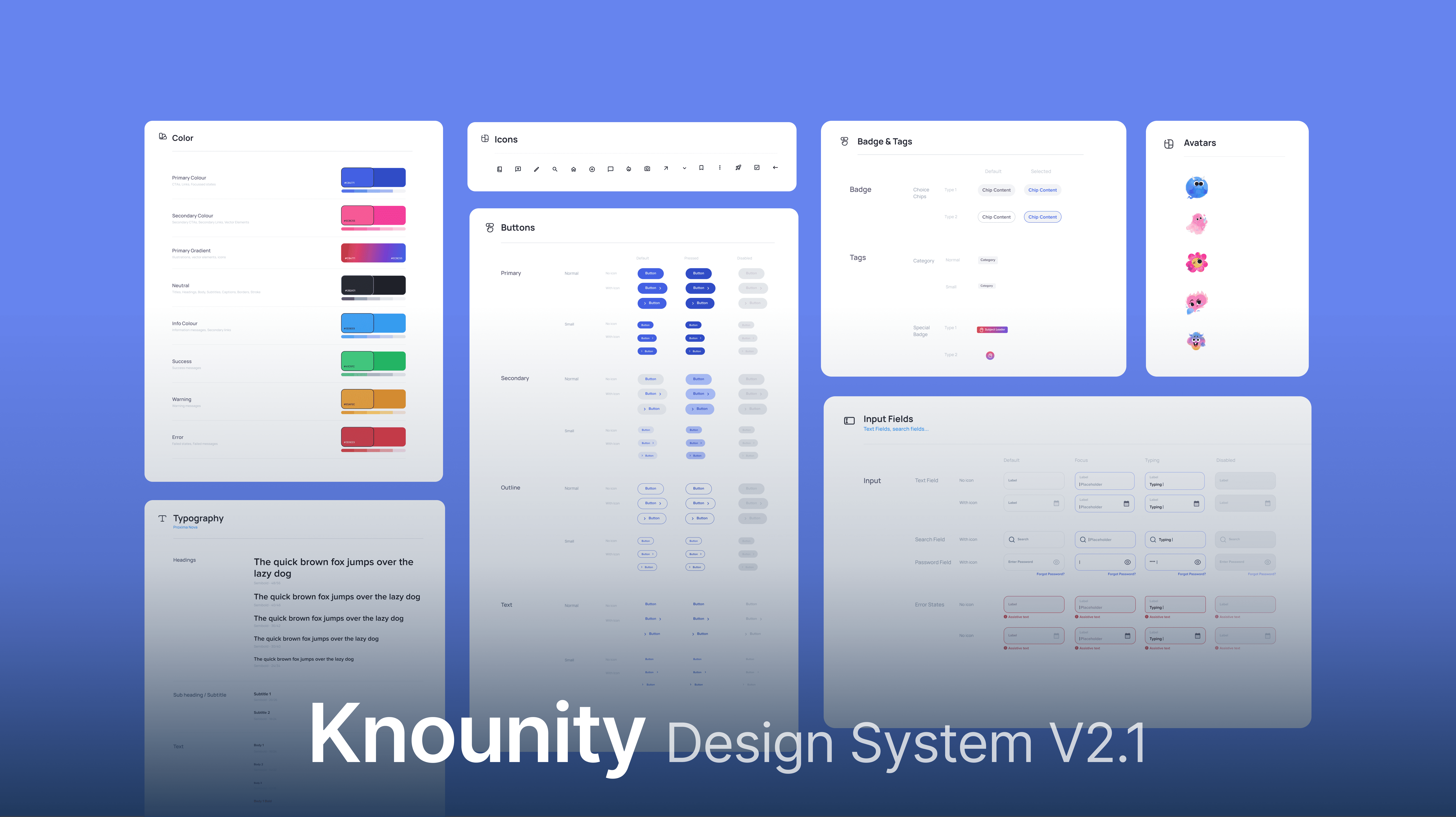
Using atomic design, I led my team to structure the system from foundational styles to full templates. This modular approach allowed for scalable, consistent design decisions across teams.

Foundation: type, color, grid
I standardized core typography styles, color tokens, and layout grids to establish visual harmony and maintain brand consistency across all screens.

Basic elements: input, button
With foundation in place, I continued to create reusable inputs and buttons with clear interaction states and accessibility in mind, optimizing for mobile responsiveness.

Complex elements: card, tabs, nav
Lastly, I designed high-utility components like cards, tab bars, and navigation systems—reducing redundancy and improving usability across key flows.

Final Impact & Benefits
✅ Better visual consistency
The new system unified the product’s visual language, reducing inconsistencies and creating a more polished, trustworthy user experience.
🚀 Faster shipping & hand-off time
Reusable, documented components sped up design and development cycles—cutting implementation time by 40%.
😎 Less back-and-forth discussion
Shared design specs and patterns aligned cross-functional teams, reducing miscommunication and streamlining collaboration.